Print Shop: The Wedding
Close friends were getting married, and I was asked to make some things for them.
The Postcards
This by far took the longest, but they came out GREAT.
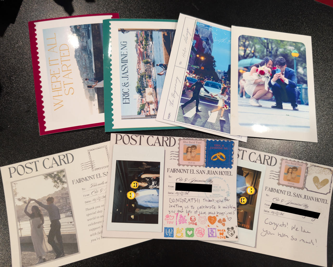
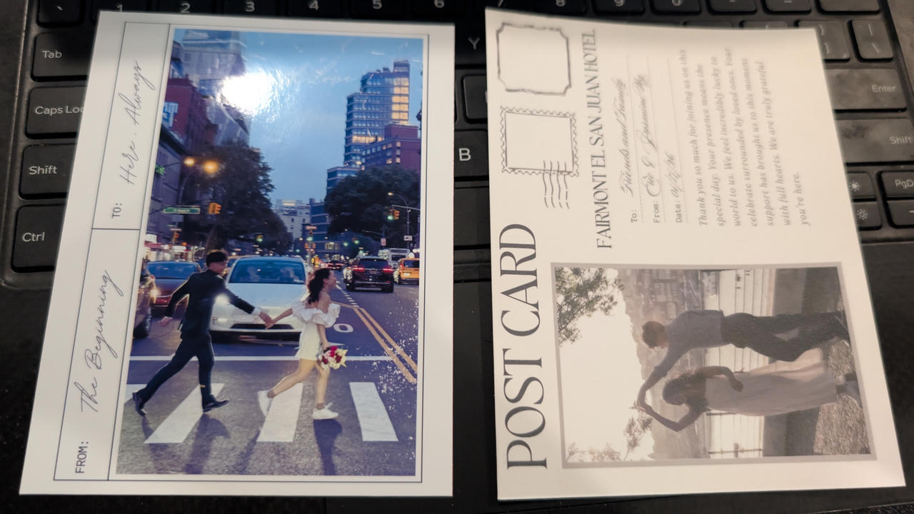
They sent over a few designs; 4 of the front (top row) and 2 of the back. Half of the postcards were to be the thank-you card (bottom left). The other half had a placeholder for people to put their own pictures from the wedding (they had those Instax Mini instant cameras), along with space to write messages, put stickers, and stamp (See image below).
They originally wanted them printed on "110lb cardstock", so I grabbed a pack from Staples and did a test print.
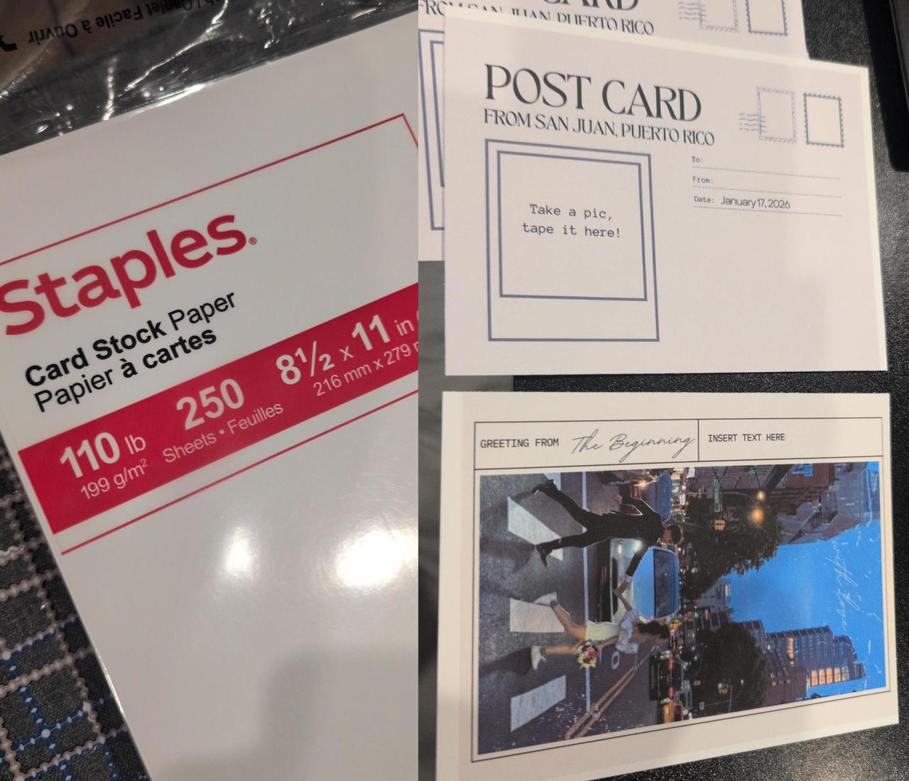
It looked okay... But I didn't like it. The paper was thick, but did not feel stiff enough for a postcard. It also looked like someone just printed them at home... (which is exactly what happened, but I wanted it to look GOOD. It is for a wedding, after all). The printed photo was just okay. I felt that it would look much better on photo paper or glossy finish, so I tried some of the glossy photo paper I had -- the photo side came out great, but it was way too thin and I couldn't print on the backside as it would not hold ink.
So I started looking around and seeing what other people are doing for something like this. Also was looking for paper suppliers. Eventually, I decided I want a "C1S" paper -- "coated 1 side". Internet people also recommended Red River Paper for sourcing nice and specialty papers. So I checked them out.
They are actually amazing. They have a handful of papers for different printing applications in different sizes. What I found amazing specifically was their resources page. They had resources and instructions from paper handling, color profiles, and printer compatibility. I see why people recommend this place, especially if you are doing prints on your inkjet printers at home. They had color profiles for all of the papers they sell, in combination of a large selection of inkjet printers you might have at home.
I wanted to actually see and feel the papers and test print some before I ordered a large quantity. You can purchase samples from them!
I really wanted the Pecos River Gloss 360 but I am using an EPSON ET-2760, which they noted that it was untested with this paper, and due to this paper being pretty thick, it will likely jam.
So I also ordered a lighter version of the paper to test, in case the 360 didn't work, and I waited a week or so until they came in.
I quickly did a print on the 360 paper. It had some issues initially, but I found that I had to feed in 1 sheet at a time, and also push in with a little bit of force. This tip from them was very helpful.
Color Accuracy
I did some test prints to get the print settings dialed in. Most of them didn't take too long (print size, color, quality, borderless, etc). However, I was not able to get the image colors quite exactly I wanted.
Even with RRP's print (quality settings](https://www.redrivercatalog.com/download/Pecos_River_Gloss_360.pdf) and the proper (color profiles](https://www.redrivercatalog.com/profiles/) for my printer model and paper, I couldn't get it right (it's possible it's caused by me using a 3rd party ink, but I don't know if that makes that much of a difference)
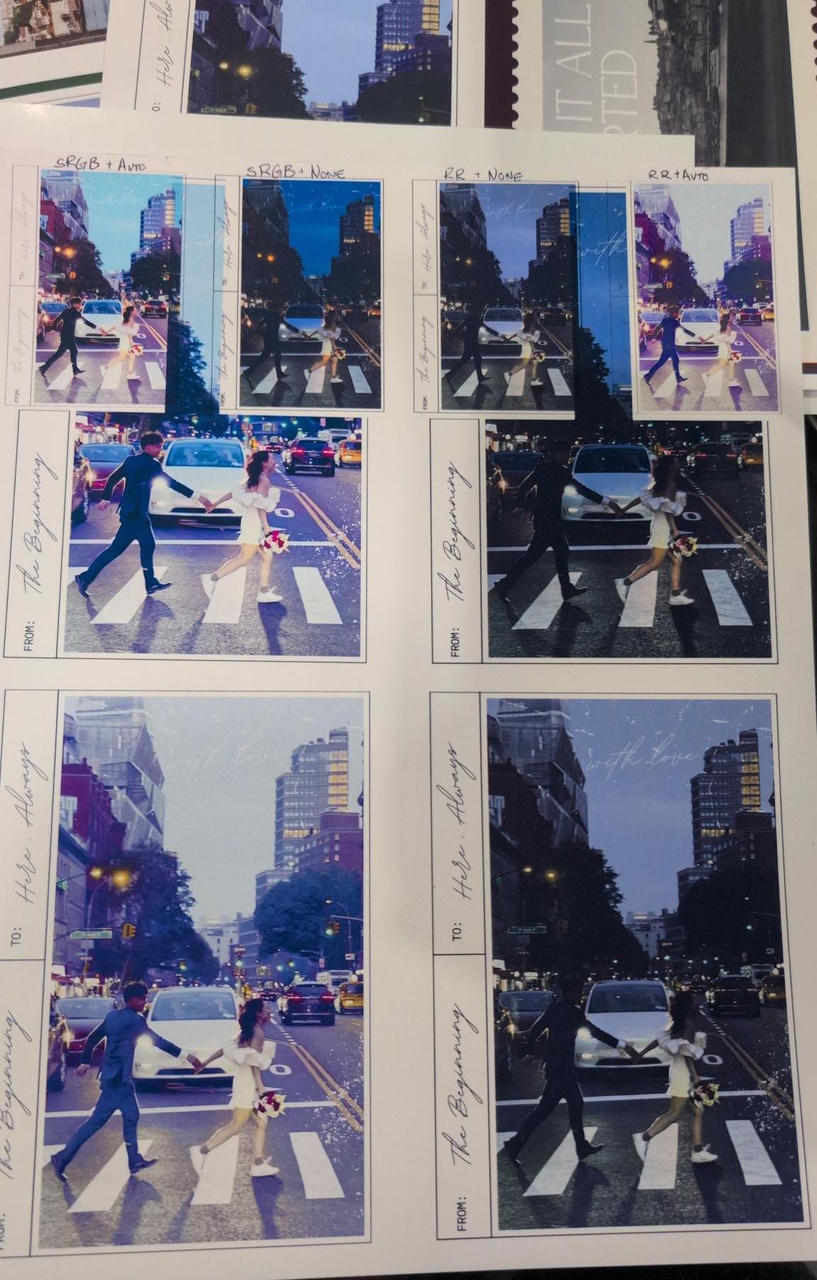
The photo above shows results from 4 different configurations: with/without the printer's auto color correction and using either GIMP's built-in sRGB color profile or the one provided by RRP. (Oh they also provide some simple guides on using the color profiles)
This is when I went down the rabbit hole of trying to create my own color profile. I tried using Argyll CMS.
It didn't work. (the software worked fine -- it's my setup)
Don't try unless you know what you're doing and have either a color calibrated camera/scanner or a very expensive spectrophotometer
So the general process of creating your own printer/display color profile is:
- Print a calibration sheet with different colors
- Use a spectrophotometer to scan it so that we can quantify what color it's actually printing.
- Use that data to create color profile.
If you don't have one of those nice, expensive spectrophotometers, there are other ways. We just need a way to compare what color the computer thinks it's printing against what we see (either on screen or on the actual print). One way to do this is to use a camera or scanner (although many experts will not recommend doing so).
But guess what? How do we know that the color the scanner is digitizing matches what we see on the actual print? We need to also calibrate the scanner if it's to be used for this purpose.
So now we have a catch-22. The chicken-and-the-egg problem.
This is usually done by obtaining a known calibration sheet, but they can be pretty expensive1. I also was tight on schedule for this project.
So I just went back and tried eyeballing it.
The major thing I didn't like about the test prints above were the amount of purple. The photo itself had a tiny bit, but the prints made it worse. So I added tiny bit of the opposite color (it was like lime-yellow-ish) and increased the brightness.
It actually came out alright. So I used that setting for the rest of the prints.
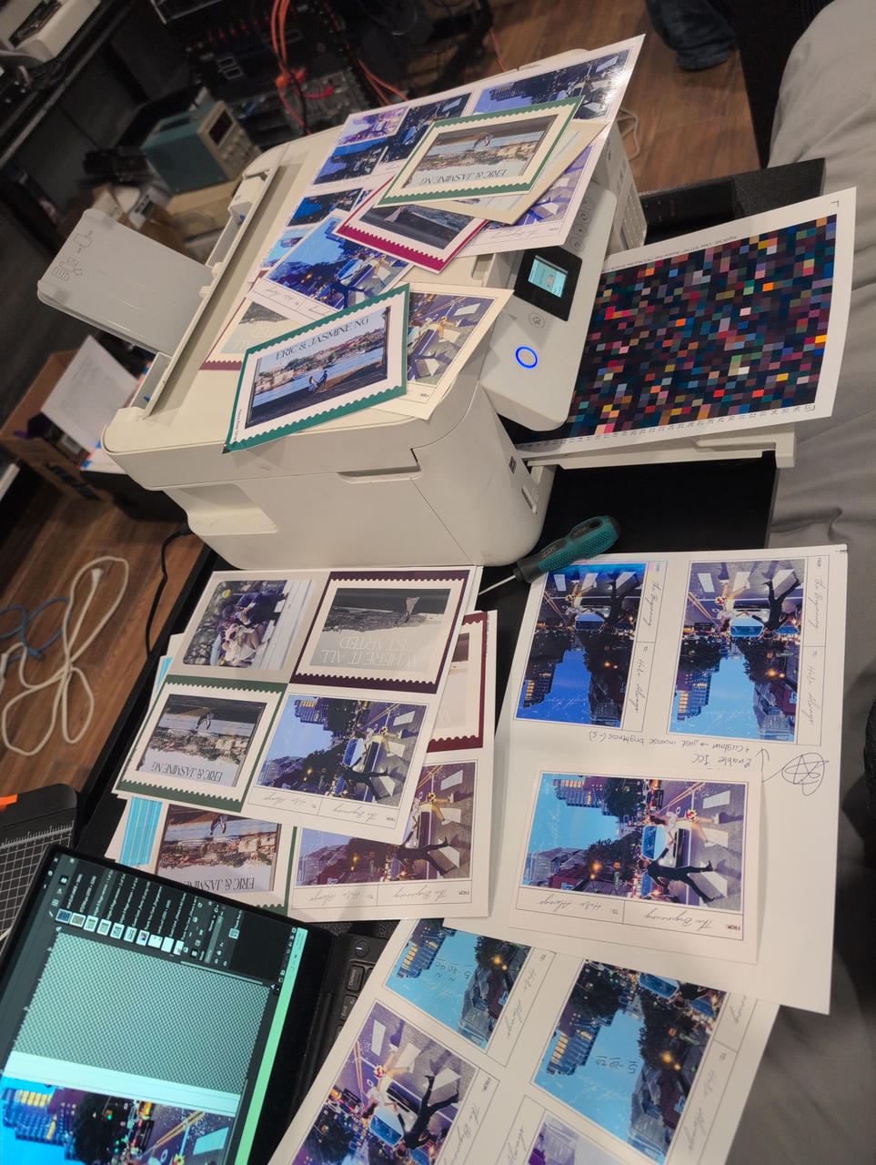
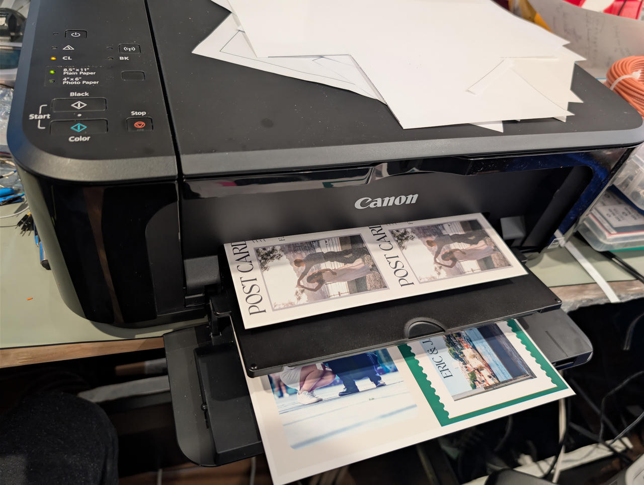
Each print (8.5 x 11 standard letter sheet) had 4 postcards and took about 10.5 minutes on high-quality. To speed up the process, I printed the back on my other printer (Canon MG3600)
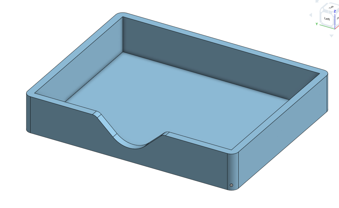
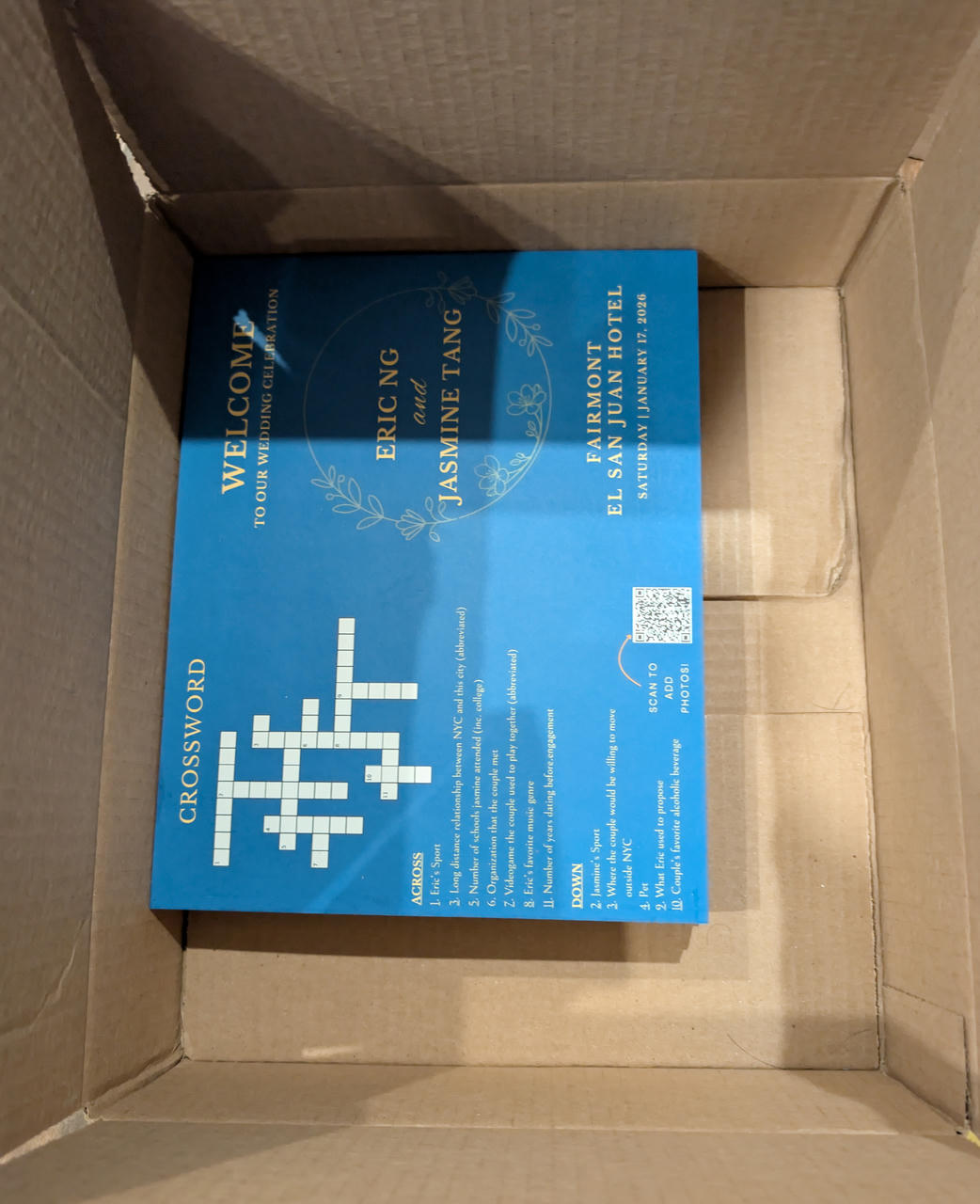
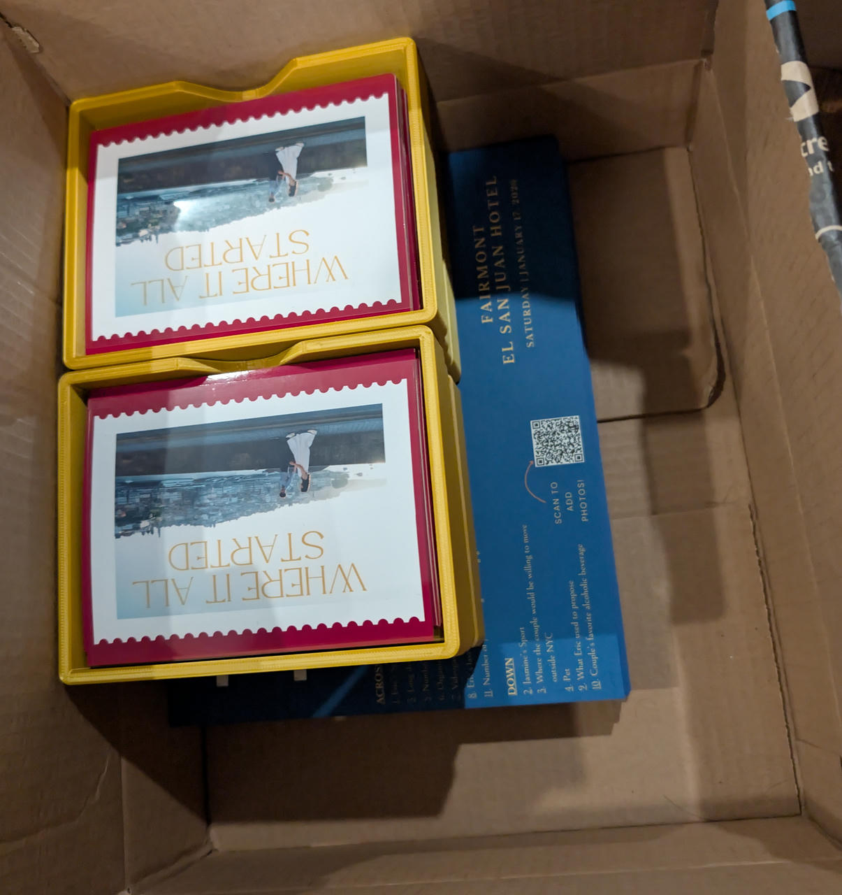
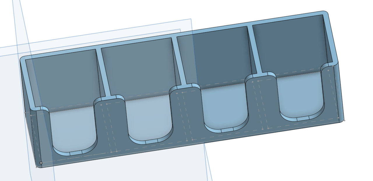
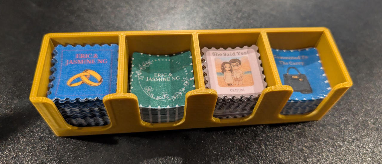
I thought it would look nice to have the finalized stacks in little boxes, so I quickly whipped this up:
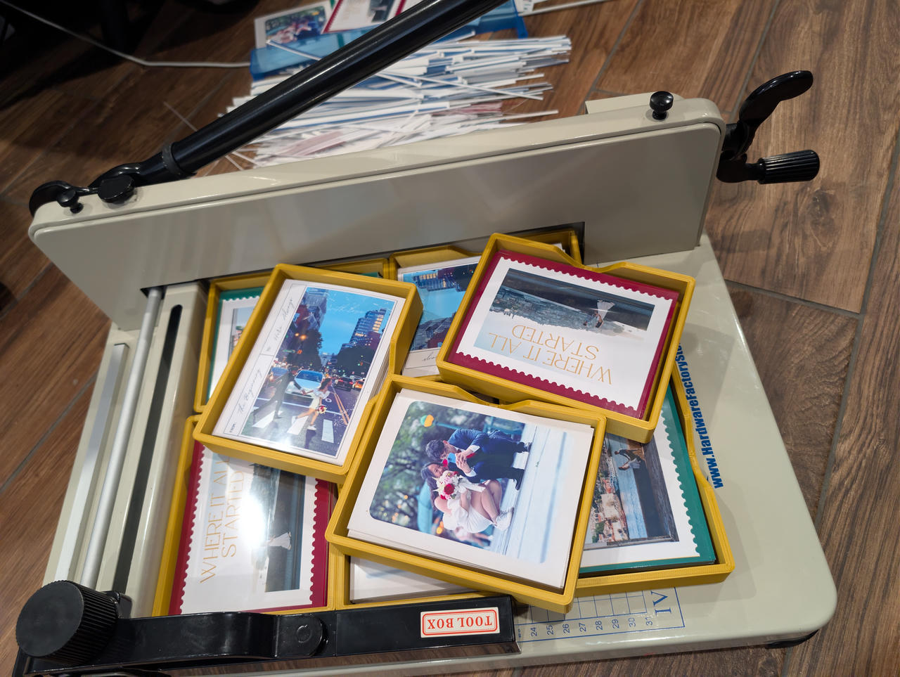
After all the printing and cutting:
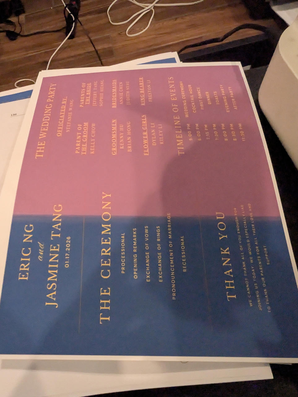
The Schedule / Program
This print was relatively straightforward. I had the 110lb cardstock I bought previously, which would serve well for printing the programs on.
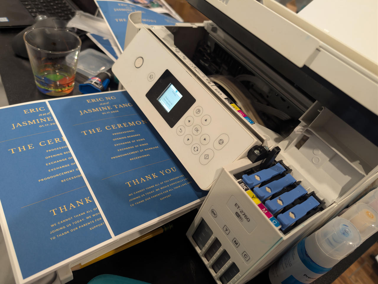
Only thing was that I should've just gotten blue paper, because I ran out of cyan ink pretty quickly...
Anyways, with the ink replenished and printing finished, they were all cut.
The Photo Frames
For any other / extra photos that were took, I also printed some of these magnetic photo frames I made earlier.
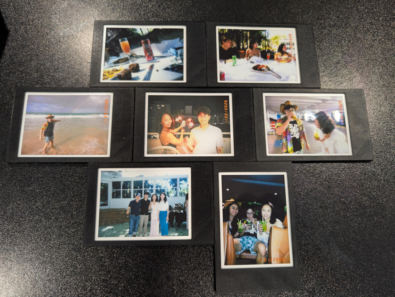
I do sell these on Etsy, but you can print your own if you have a 3D printer 3D model
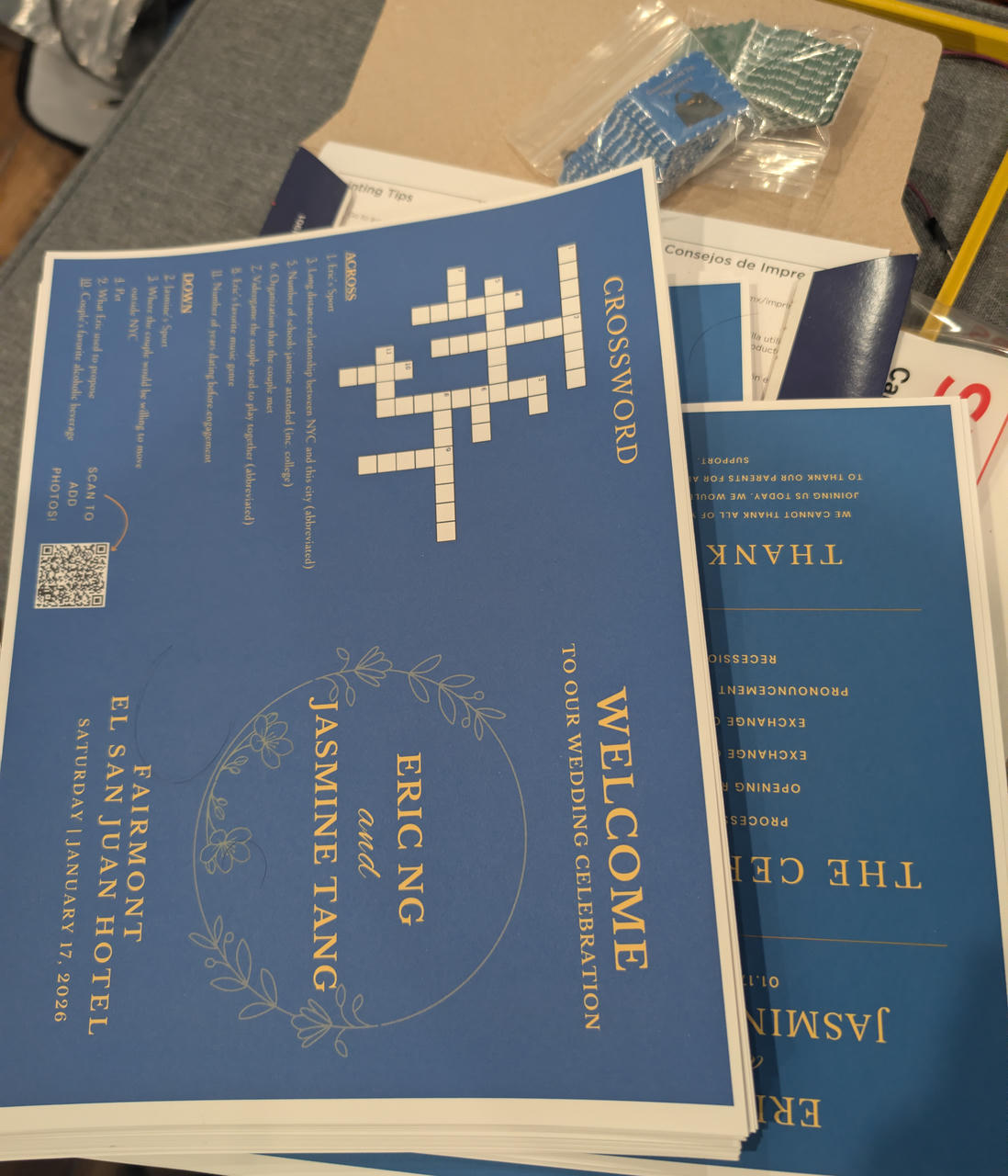
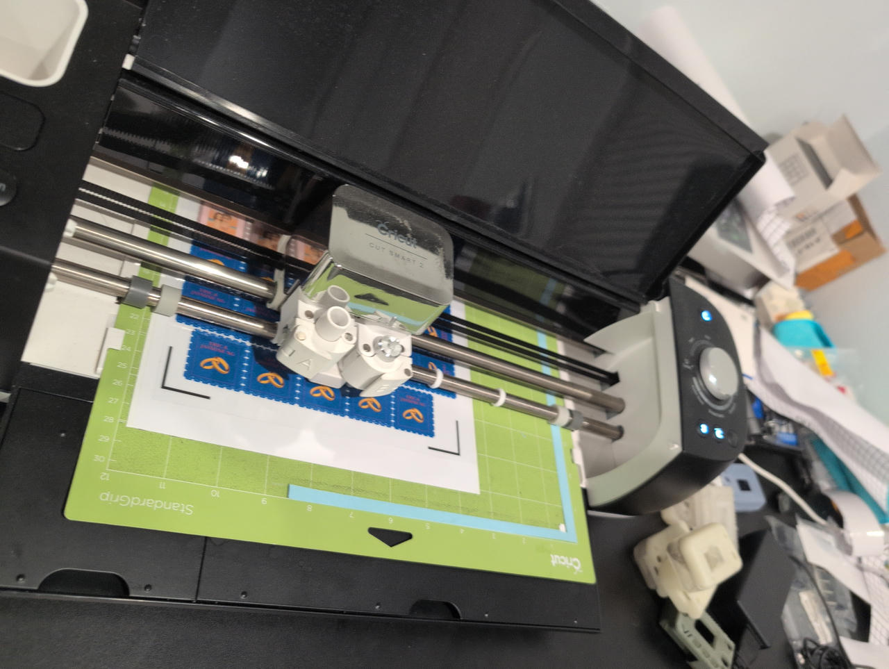
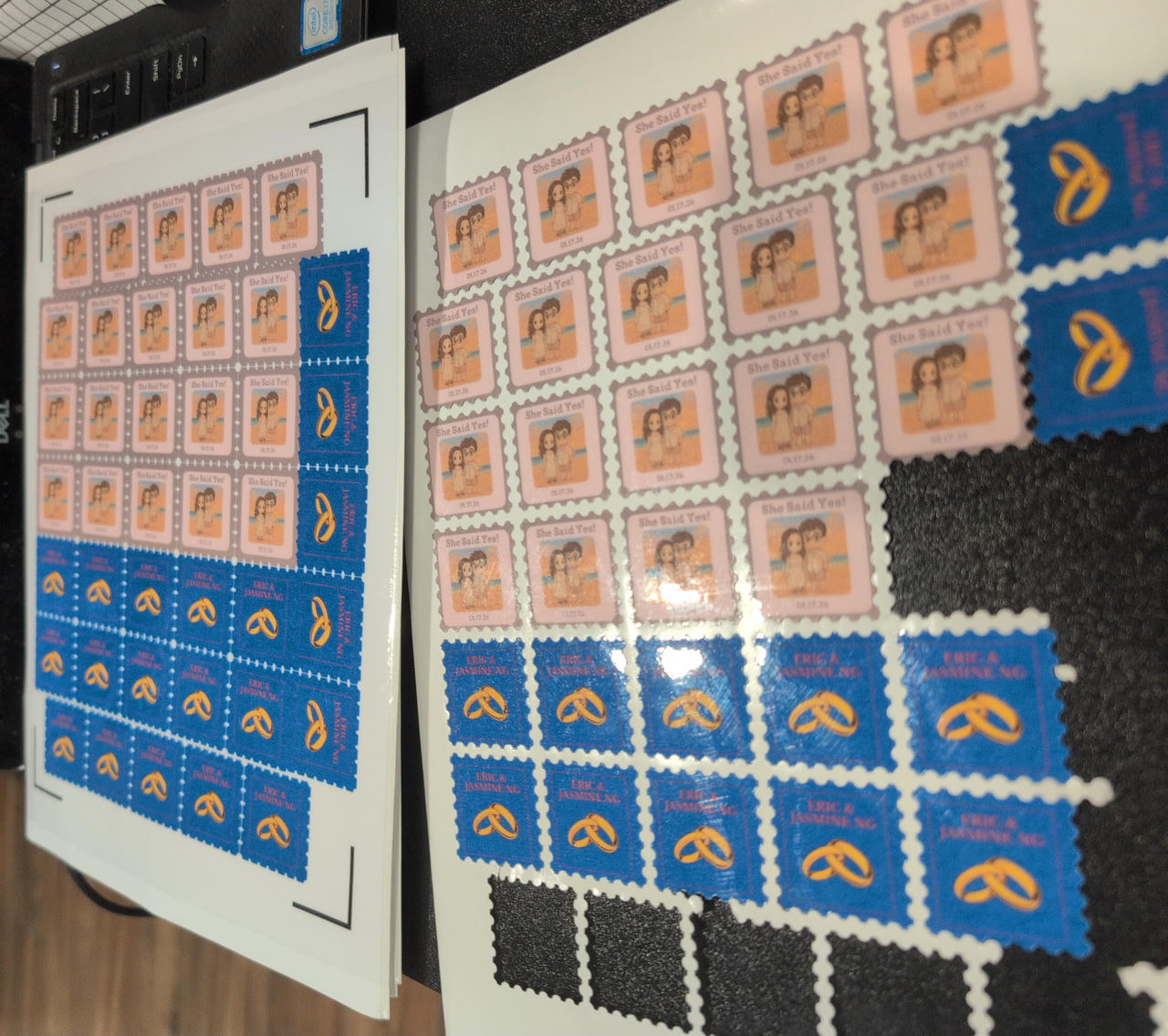
The Stickers (Stamp)
I've also been making stickers for friends for a while now, so I've kinda got this down.
They sent over some designs. I remove the background and do some test prints to see if the colors and size look ok.
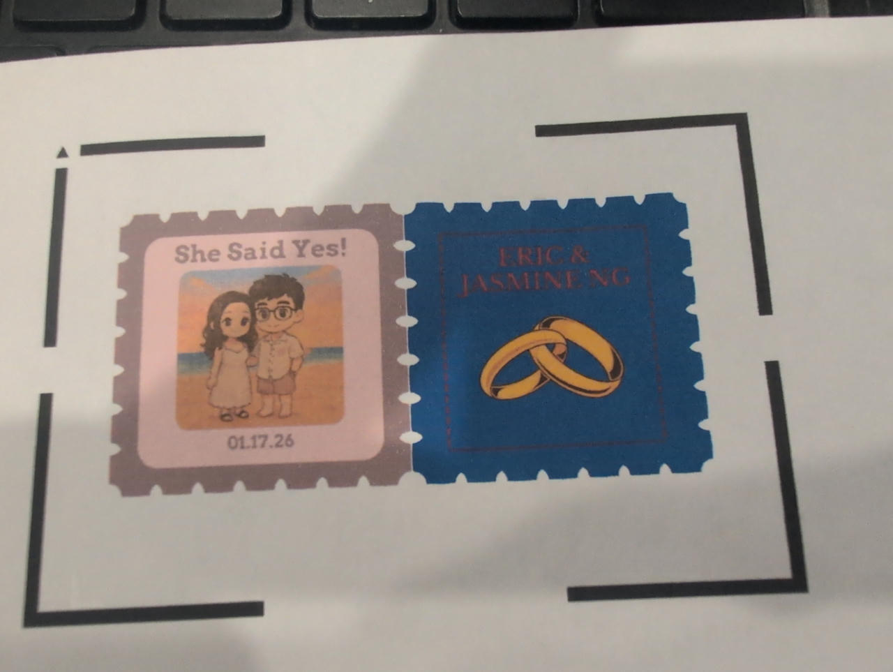
I think I made the text a bit brighter and more legible for the stamp on the right.
I then import the graphic onto Cricut Design Space. I do not like using it, but I have a Cricut machine so I have to use it for print-and-cut operations. I lay them out (as many per sheet as possible). I print, with adds these markers around the corners. These are used by the cutters to detect where the corners are. This helps if the print was slightly warped or shifted and the cutter calculates the correct position and shifting.
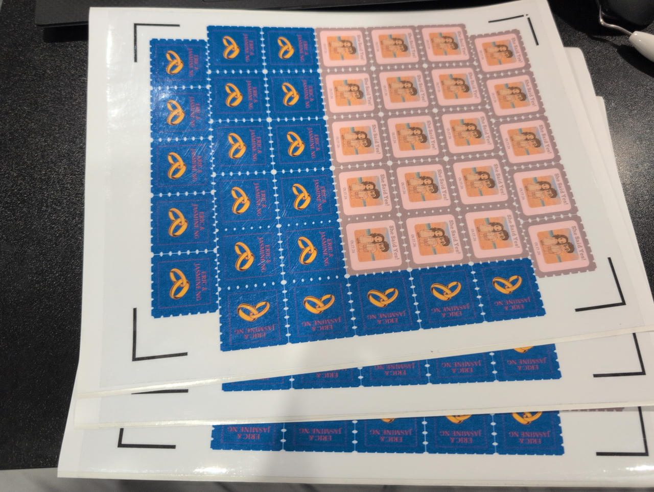
After that, I apply a adhesive laminate (I use something like this). I guess this isn't necessary anymore, since, when I used to print stickers on a laser printer, the toner/ink/print would rub off over time. I use an inkjet now, but it still gives a bit of protection. If you look carefully, you can see the applied laminate on the sheets.
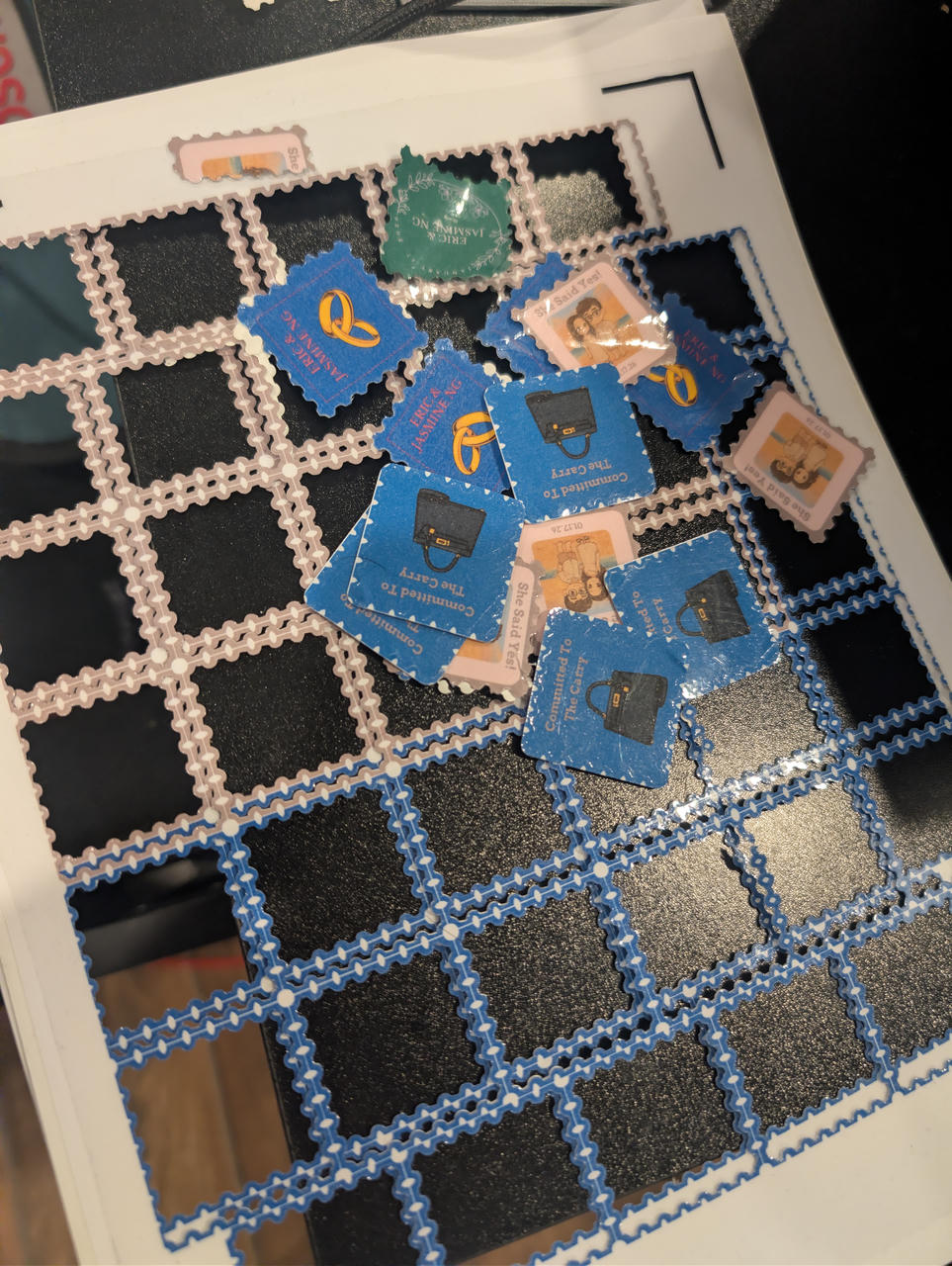
I then run the cutting step.
I've recently tuned in my cut settings as well, so now I can do a kiss cut right up around the graphic and then die cut with a border around2.
Once cutting is done, I take it off the cutting mat (if the die-cut didn't go through fully, I have to pop them off the sheet)
I had few that didn't cut fully or got messed up.
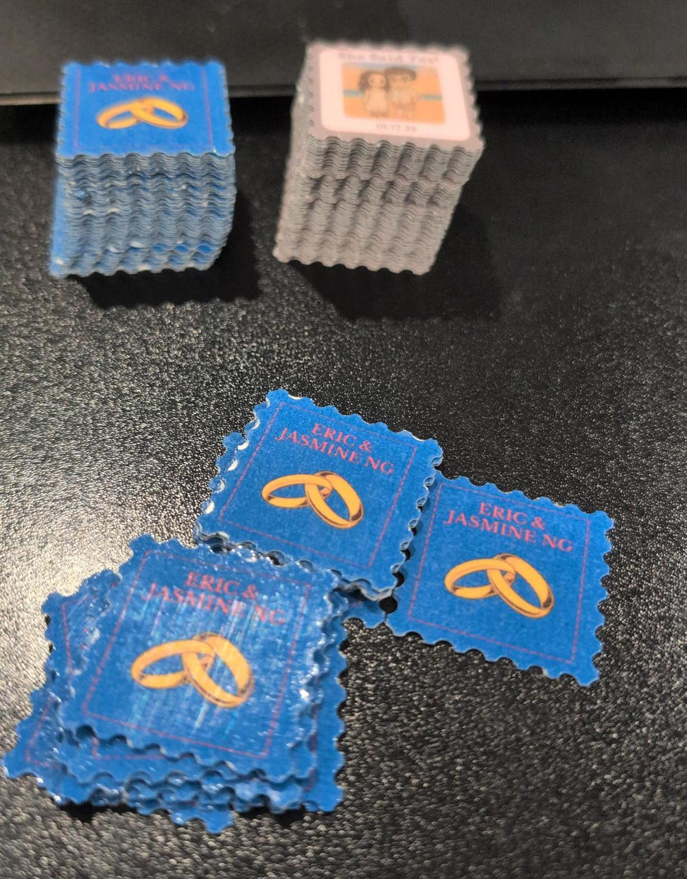
Finished stickers:
Also designed a nice holder for them:
Results
And with all of those, people came up and took photos and filled out the postcards. (There were also stamps, but I didn't make them) (I have made stamps with 3D prints, so maybe I can write that up too).
It's the same photo from the beginning of the post.
But with that,
Congratulations to the couple!
73,
-B
-
https://www.argyllcms.com/doc/Scenarios.html#PS1 ↩
-
Die cuts are ones that go all the way through. Kiss cuts just cut the upper sticker layer. This makes stickers easier to peel. More on die-cut vs kiss-cut ↩